Photo Gallery Website vs Lead-Generating Website: What’s the Real Difference? (2026)

Many business owners proudly say, “My website looks beautiful.” The photos are sharp. The gallery scrolls smoothly. The colours feel premium. Then weeks pass — and the phone stays quiet.
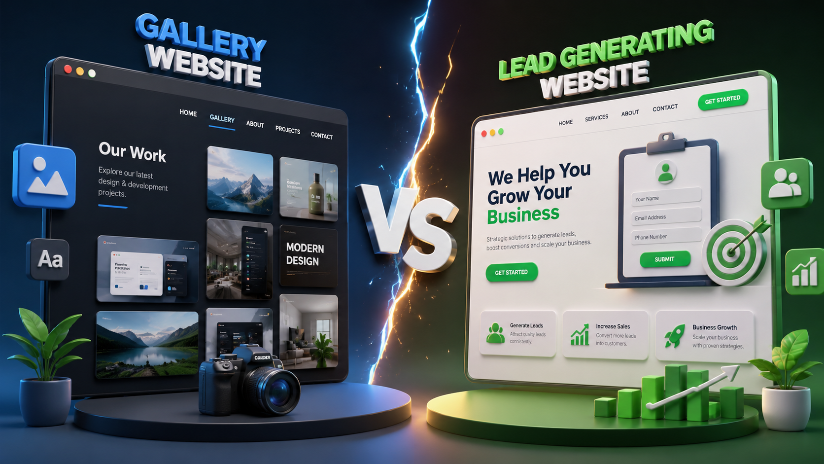
That gap is common. A photo gallery website and a lead-generating website can look similar on the surface, but they are built for completely different outcomes. One is made to be admired. The other is made to create enquiries.
At Web Developer Kashi in Sigra, Varanasi, we see this every month: restaurants, guest houses, wedding planners, coaching institutes, clinics, and shops spend on design — then ask why calls and WhatsApp messages are not coming. This guide explains the difference in plain English, so you can decide what your business actually needs in 2026.
- Open your homepage on a phone.
- Can a stranger understand your offer in 5 seconds?
- Is there a clear Call or WhatsApp button without scrolling?
- After looking at photos, do they know the next step — or just swipe and leave?
If the answer is “look and leave,” you likely have a gallery site — not a lead engine.
What is a photo gallery website?
A photo gallery website is built around visual showcase. Typical features include:
- Large hero banners and image carousels
- Service or product photo grids
- Portfolio / event albums / room photos
- Soft, aesthetic design with long scrolling sections
- Contact page somewhere in the footer or menu — but rarely on the first screen
This style works well for awareness: “See how our work / rooms / dishes look.” For many Varanasi businesses — especially wedding venues, hotels near the ghats, Banarasi showrooms, or event planners — photos are essential. The problem starts when the website stops there.
A gallery website answers: “What do you look like?”
It often fails to answer: “How do I book / call / get a quote right now?”
What is a lead-generating website?
A lead-generating website is built around business action. Beauty still matters, but every section has a job: reduce doubt, build trust, and push the visitor toward contact.
Core elements usually include:
- Clear headline — who you serve and what you offer
- Primary CTA — Call, WhatsApp, Book Now, or Get Quote above the fold
- Offer clarity — packages, price range, or “from ₹X” when useful
- Trust signals — reviews, years of experience, certifications, client logos
- Simple forms — name, phone, message (not 12 fields)
- Mobile-first speed — because most local traffic is on phones
- Local SEO structure — location, services, Google Business Profile consistency
A lead-generating website answers: “Why choose you — and how do I contact you in one tap?”
Side-by-side comparison
| Factor | Photo Gallery Website | Lead-Generating Website |
|---|---|---|
| Main goal | Look impressive | Create calls, chats, bookings |
| Homepage focus | Images and vibe | Offer + CTA + proof |
| Call to action | Buried or weak | Visible on every key page |
| Mobile experience | Heavy images, slow load | Fast, sticky WhatsApp / Call bar |
| Visitor outcome | “Nice photos” then leave | “Let me message them now” |
| Business value | Brand showcase | Sales pipeline |
Why so many “beautiful” websites get zero leads
Design agencies and freelancers often deliver what the client asked for: “Make it look premium.” Nobody defined success as “X enquiries per month.” So the site becomes a digital brochure with no conversion path.
Common traps:
- Photos without a pitch — visitors see rooms or products, but not prices, process, or service areas.
- No sticky contact buttons — on mobile, contact is 6 scrolls away in the footer.
- Generic About text — “We are a best company…” instead of proof and local relevance.
- Slow loading — oversized gallery images; users bounce before the CTA appears.
- Form friction — email + company + budget fields that stop busy phone users.
- No Google Maps / review link — strangers cannot verify you quickly.
- Menu-only contact — one Contact page, no CTAs on service pages.
If this sounds familiar, also read our related guide: Website is live but leads are not coming — 7 reasons & fixes.
When a gallery-style site is enough
Not every project needs aggressive lead capture. A gallery-first approach can work when:
- You are a creative studio showing completed work for brand building
- Leads come almost only via referrals, and the site is supporting proof
- You sell offline appointments and already get walk-ins from other channels
- The gallery is shared as a link after a WhatsApp introduction (“see our work”)
Even then, adding one clear WhatsApp button usually improves results without killing aesthetics.
When you need a lead-generating website
Choose a conversion-focused build (or upgrade) if:
- You pay for Google or Instagram ads and need the click to convert
- You want local search traffic from people searching “near me”
- Your competitors are getting calls while you only get “likes” on photos
- You sell services with clear packages — hotels, tours, coaching, clinics, repairs
- Your team cannot reply to Instagram DMs all day — you need structured enquiries
For local service businesses in Varanasi and across UP, the lead-generating model usually pays for itself faster than a pure gallery redesign.
How to upgrade a gallery site without throwing it away
You rarely need to scrap good photography. You need to wrap conversion around it.
1. Rewrite the first screen
Hero image can stay — but add:
- One clear outcome line (e.g. “AC guest rooms near BHU — WhatsApp booking”)
- One primary button (WhatsApp / Call)
- One secondary option (View Packages / Get Quote)
2. Put CTAs near every gallery
After a photo block of rooms, dishes, or past events, add a short line: “Like this? Ask for today’s availability.” + WhatsApp. Images create desire; the CTA captures it.
3. Compress images aggressively
A slow gallery kills leads. Use modern formats (WebP), correct sizes, and lazy loading. Beautiful + slow still loses to average + fast.
4. Shrink the enquiry form
Three fields beat ten: Name, Phone, Message. Offer optional date/service later in the chat. Many Indian buyers prefer WhatsApp over forms — support both.
5. Add trust next to the photos
Reviews, ratings, Google map embed, years in business, “served 500+ guests” type numbers — proofs next to visuals close the gap between “nice” and “trusted.”
6. Align Google Business Profile
Same business name, phone, address, and website URL everywhere. Photos on Maps + a site that converts create a complete local funnel. Guide: Google Business Profile for Varanasi businesses.
Checklist: is your site gallery or lead-ready?
Gallery-heavy signs
- Homepage is mostly images and little text
- Contact only in menu / footer
- No sticky Call / WhatsApp on mobile
- Pages end with “Thank you for visiting”
Lead-ready signs
- Offer clear in first screen
- CTA repeated on services / gallery pages
- Fast mobile load + click-to-call
- Proof + FAQ + easy enquiry path
Examples of the right balance
Strong local sites often combine both worlds:
- Guest houses / hotels — room photos + tariffs + WhatsApp booking (see projects like Samriddhi Hall style sites in our portfolio)
- Tour operators — destination visuals + package CTA + Razorpay / enquiry (Bella Travels style booking flow)
- Clinics / coaching — facility photos + appointment or fee enquiry buttons
- Jewellery / handloom — catalogue images + call for rate / WhatsApp for designs
Photos create emotion. Structure creates business.

FAQs — Gallery Website vs Lead-Generating Website
Quick answers to common questions. Still need help? We’re just a message away.

WhatsApp, email or a call — pick what is easy.
Conclusion
A photo gallery website shows your world. A lead-generating website invites the visitor into a conversation — and into your calendar, inbox, or WhatsApp.
In 2026, looks alone are not a strategy. Your competitors may have fewer photos and more enquiries simply because they ask for the next step clearly, on every device, on every important page.
If your site is beautiful but quiet, the fix is usually not “more images.” It is better structure: offer, proof, and one-tap contact.
“Photos open the door. A call-to-action asks people to walk in.”
Get a free consultation · WhatsApp +91 96967 26607 · Website development services